Dining Room e-design
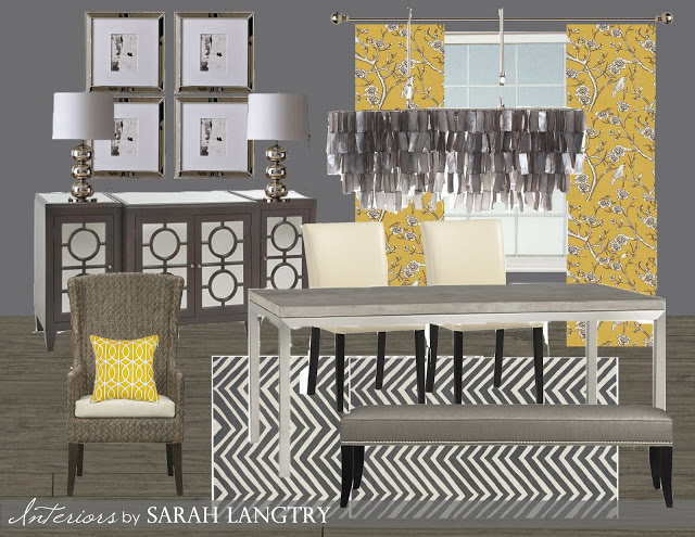
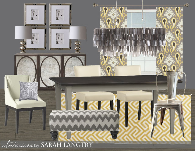
I recently had the opportunity to work with a close friend and create a mood board for her new dining space. Her and her husband are building their new home which now includes a formal dining room, something they never had before, so they needed furniture to fill the space. The flooring and paint colors were already chosen, so my job was to find some furniture and fabrics to meet the functional needs of the space but that also coordinated with their open concept floor plan. Her colors throughout the main floor are basically grays and whites with pops of yellow and a touch of violet. Their style is a mix of clean, modern lines with a chic elegant feel and a few traditional touches. After speaking with them, we determined that they would be using this space as their main dining space, but would need a table and extra seating that would accommodate large family gatherings. Here's the first draft of the mood board I put together.
My client found the buffet at a local store and really loved the circular mirror pattern, so I sourced some furniture that would coordinate nicely. The table is big enough to accommodate large groups, and the bench adds additional seating when needed, and could be stored under the window when not in use. I also love to mix up the chairs to keep it interesting. The only snaffo in this design was that when we went on site to measure, I discovered the light fixture was placed in the center of the room, so that changed our furniture placement and the table and buffet were simply too wide for the space. And the hubs wasn't all too crazy about the bird pattern on the drapery fabric, even though the wife absolutely loved it!! (That girls got taste, I tell ya! And aren't those floors to die for!! I LOVE the grey wood. Amazing choice.)
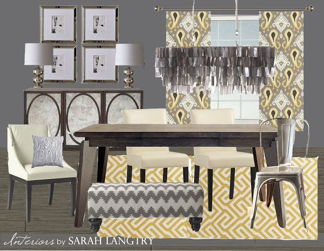
A quick re-group and re-source for a narrower table and buffet led to the final revised mood- board.
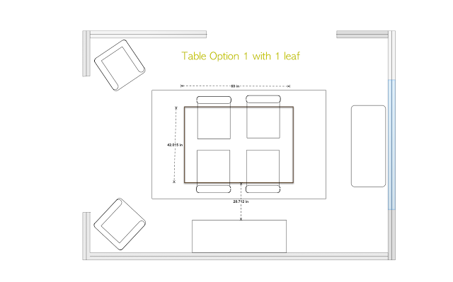
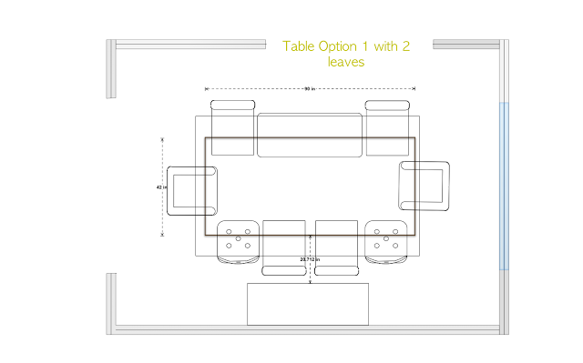
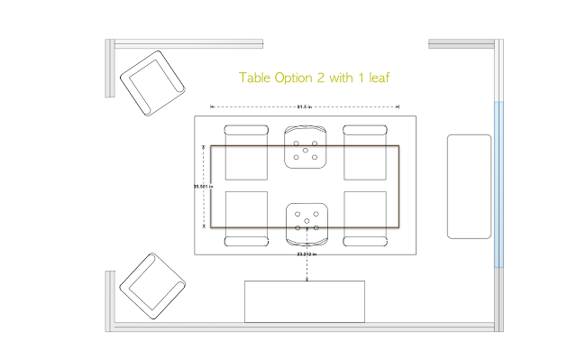
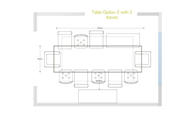
I found a buffet that was really similar to the first one with a mirrored front with circular details, but this version was a few inches narrower than the first, and those few inches can make a world of difference! I also gave them another option for the curtain fabric with coordinating rug and accents. I had 2 options for tables. Both were expandable. The first accommodates less people and was reasonably priced. The second will seat a few more people, but was also quite expensive. I made a few floor plans to send along with the mood boards so my clients would be able to make an informed decision. When ever buying new furniture for a space, it is SO IMPORTANT to sketch out a floor plan first to make sure everything will fit!! I cant stress this enough!
And here's the second table option.
They move in soon and I can't wait to see what they ended up choosing for the space!! I love edesign for the fact that it can serve the client as a design to be exactly replicated with a full list of sources, or can be used as a starting point to help guide you in your choices.
What do you think of edesign? Have you ever used this service before, or thought about using it? I'd love to know!!
