Everyday Design Dilemma ~ How to combine a Living Space and Home Office Space
As more and more people are beginning to work out of the home, a dedicated home office space is a necessity. But what if you just don't have the space to accommodate an entire room strictly for work? Well, but taking a larger space in your home, such as your living room, and dividing it in order to incorporate an area for work, you can seamlessly fuse the two together by choosing well thought out pieces that blend effortlessly.
My sister and her fiancé recently experienced this dilemma. A new job meant working a few days a week at home, so they needed to reconfigure their living room to accommodate a space dedicated specifically to those days spent in the home office. When walking through the front door of their Victorian Row House, the living space is the first thing you see, so they needed suggestions on furniture placement as well as choices that would meld the two separate spaces together so they seemed like one, and didn't scream "Home Office!" when you enter the room.
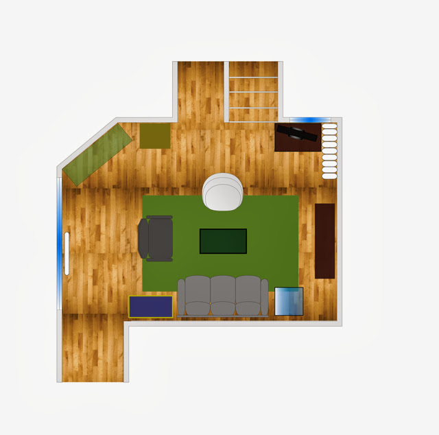
Today I'm going to walk you through how I took this one larger space and divided into two smaller ones using only furniture placement as room dividers. Lets take a look at the layout before.

It's a pretty standard living room layout with a conversational area and a defined traffic flow to the kitchen and staircase. A victorian fireplace is the focal point of the room which rests on the angled wall. One of the requests they had in creating a new layout was to improve the sight line to the tv since it was a bit far away in the current floor plan, and to maintain a small bar area near the fireplace. There is no overhead lighting in the space, so bringing in more lighting sources is a must. Now lets take a look at the re-configured space and I will explain what I did & why!
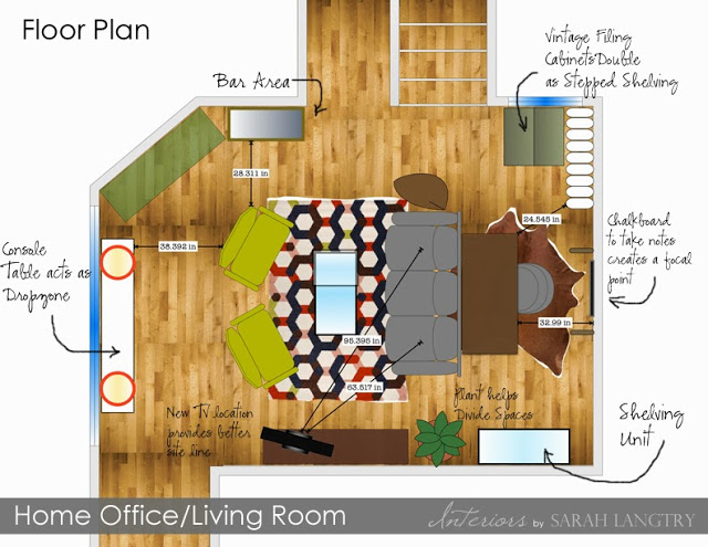
I knew that I didn't want to put the desk up against a wall, because frankly, thats not a very motivating way to spend the day. I also wanted to keep the living space near the fireplace, so by floating the couch and using it as a room divider, we have instantly created the 2 defined spaces. Placing the desk behind the couch creates a much better view for working, and the tv is visible from the desk as well so we can stay updated on the hockey game.
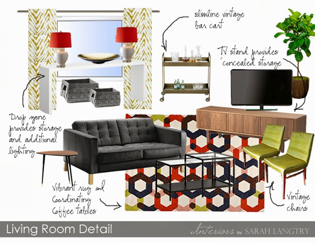
In the living room, a new tv console provides a better sightline to the tv and adds storage. A narrow console table by the front entrance makes the perfect drop zone and gives us an surface to add some lamps for additional lighting. A slimline bar cart next to the fireplace functions as the bar for entertaining and doesn't take up too much room in the main traffic area.
I chose a mix of new pieces and vintage pieces for a mid-century modern feel. A vibrant rug adds
pattern and color, tying into the existing color theme throughout the rest of the townhouse. When choosing furniture for a small space, its SO important to be mindful of the size of the pieces you are purchasing. I cant stress this enough! Even a few inches can make a world of difference between the space feeling cozy vs. cramped. Carefully measure each piece and make a floor plan before diving into any big purchase. The coffee table I chose is narrow and made of glass so it doesn't take up much room and provides an open feel to the space. A few vintage side chairs will add additional seating while not taking up too much space.
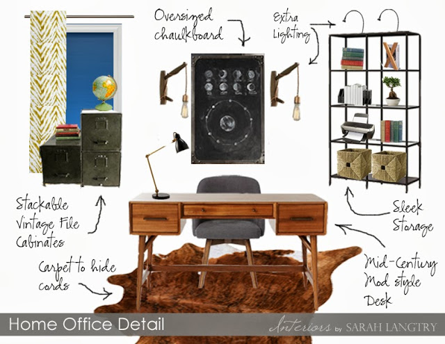
Now lets take a look at the choices I made for the Office Area.
The most important piece for this space is the desk. By choosing a piece that also had a mid-century vibe to it, the two spaces are instantly co-ordianted without being too matchy-matchy. And because it is part of the main living space, we want it to be easy on the eyes as well. I removed the dark and heavy bookcase they had and replaced with a more lighter and airy glass version. Task lighting placed on top of the bookcase gives us much needed lighting, and wicker baskets cleverly disguise any papers and office supplies we want to keep hidden. Vintage file cabinets are also functional and decorative.
The wall behind the desk is now empty since we relocated the bookcase. We needed a focal point, so an oversized industrial chalkboard flanked by sconces is perfect for taking notes, but also doubles as a piece of art. The sconces are actually braided cords with Edison bulbs that are plug-ins and not hardwired. Perfect for apartment living!
By careful choosing the right size and style of furniture, combining any 2 zones into one large space is something that is attainable for any home, regardless of size. My sister and her fiancé have already implemented a lot of the changes I suggested and have even purchased a few of the pieces. I cant wait to see the finished space and will share with you when its done!
Have you ever had a dual functioning space in your home? Did it work for you? What are some of the design challenges you overcame?
New here? Don't miss a thing! Get posts delivered directly to your inbox! Click here to subscribe!


